SPEC WORK
Selected spec work for a fictional brand called Pattern which specializes in removable wallpaper for temporary spaces. I developed all aspects of the brand, including visuals.
Pattern is an innovative home decor brand producing high quality, contemporary wallpaper motifs. Their products make it easy to personalize your space without the commitment of traditional wallpaper thanks to their self-adhering technology. They target adults ages 25 - 30 who are renting their current living situation. Their customers are on the pulse of trends and highly value self-expression. Their products are low commitment as they are as easy to install as they are to remove.
BRAND TAGLINE
Never repetitive.
-
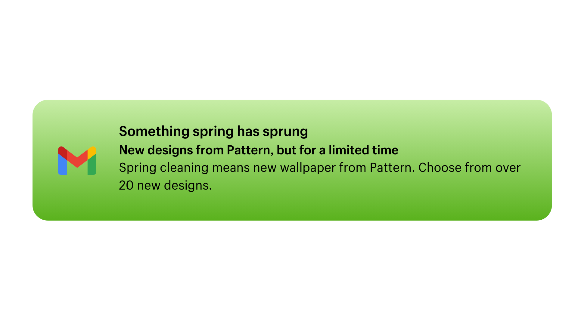
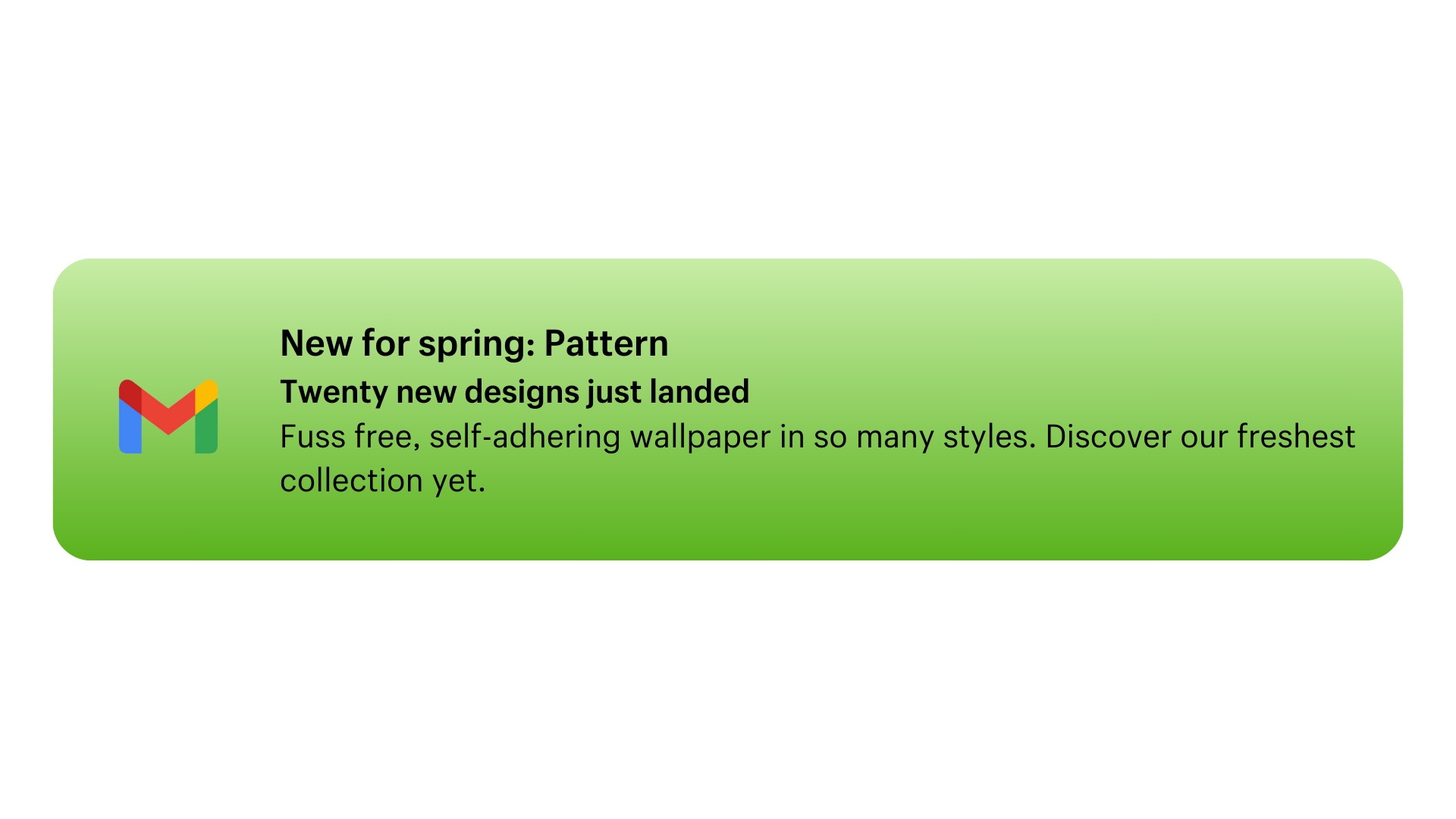
Subject line, preheader, and body copy for new collection launch moment.
-
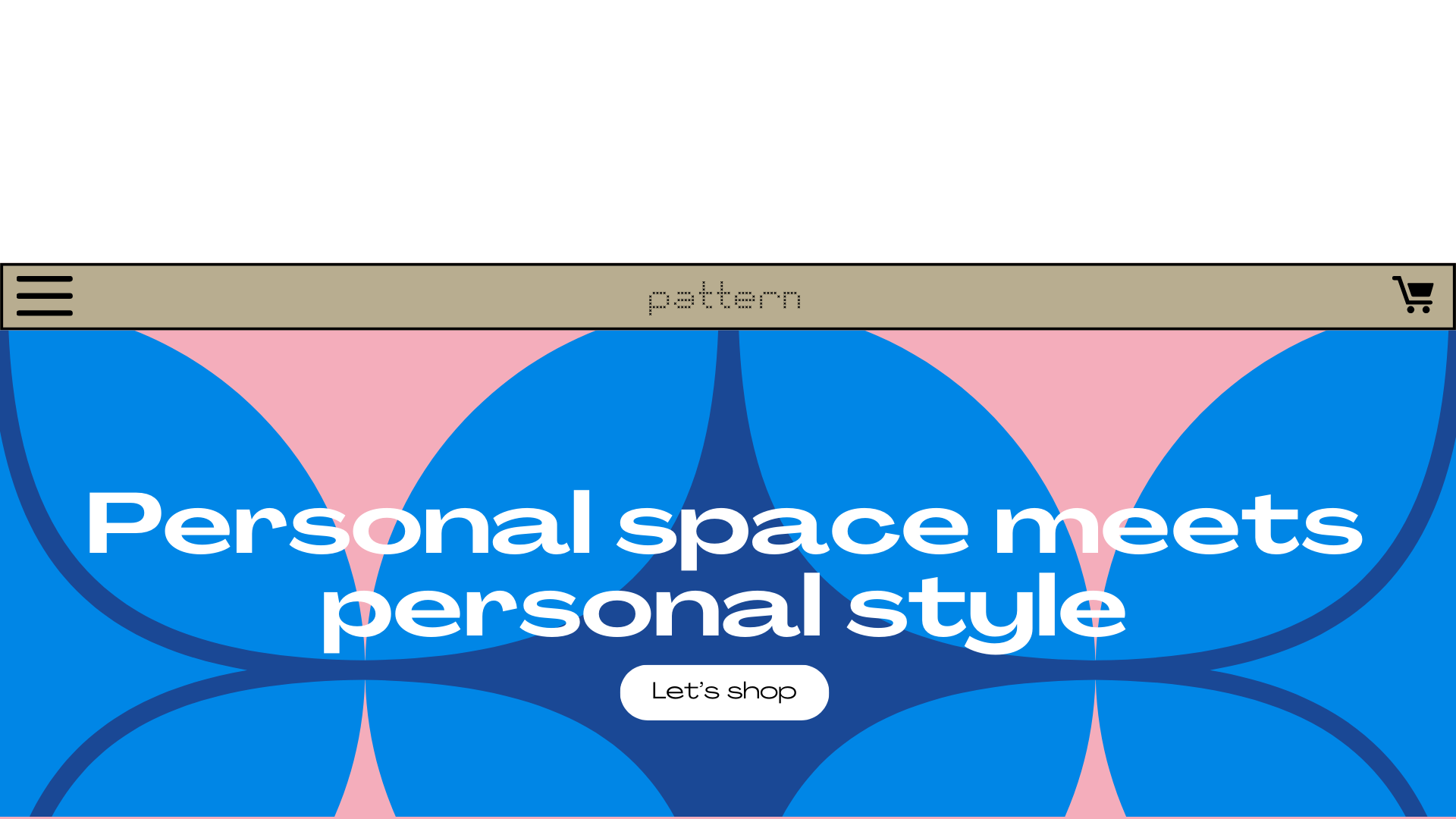
On-site copy for home landing page on Pattern’s fictional website
-
Bespoke article for Pattern’s fictional in-house digital magazine ‘Swatch’
E-mail marketing
Lead customers to browse a seasonal collection using intriguing subject lines. Capitalize on their interest and invite them to browse through the preview text.
THE INTENTION
Pattern is modern, but not robotic. It was crucial to avoid language that could be perceived as impersonal. The approach was to grab customers’ attention by tapping into their penchant for newness and current trends.
APPROACH
Homepage hero
Communicate Pattern’s wide range of designs and compel visitors to shop using only a headline and a CTA button.
INTENTION
Research was conduced with a focus on brands in the home decor space who have similar value propositions:
ease of use
high number of options
low investment
It was important to demonstrate Pattern’s competitive advantage on their landing page (ultra modern designs) by engaging visitors to think about how incorporating wallpaper into their homes can be an extension of their personal style.
APPROACH
Blog content
Reach customers searching for design inspiration through Pattern’s digital magazine, ‘Swatch’. Each of their posts touch on interior design topics including interviews, education, and trend reports. It must include:
Primary keyword: Accent wall ideas
Secondary keywords: Renter friendly wallpaper, what is an accent wall?
INTENTION
This post was inspired by similar brands in the wallpaper / paint category like Otto Studio and Farrow & Ball. The specificity of its topic, accent walls, can link directly to selected products on the Pattern website while still acting as impartial inspiration to the reader.
APPROACH
“There has long been an outdated belief that dark colours can make a space feel closed in. That’s simply not true. In fact, the richness of colour can do so much to open up a room in ways that range from cosy and intimate, to bold and brave. That’s why we’ve curated six of our deeply saturated, renter-friendly wallpaper designs to get you in the mood to design your next accent wall.”


